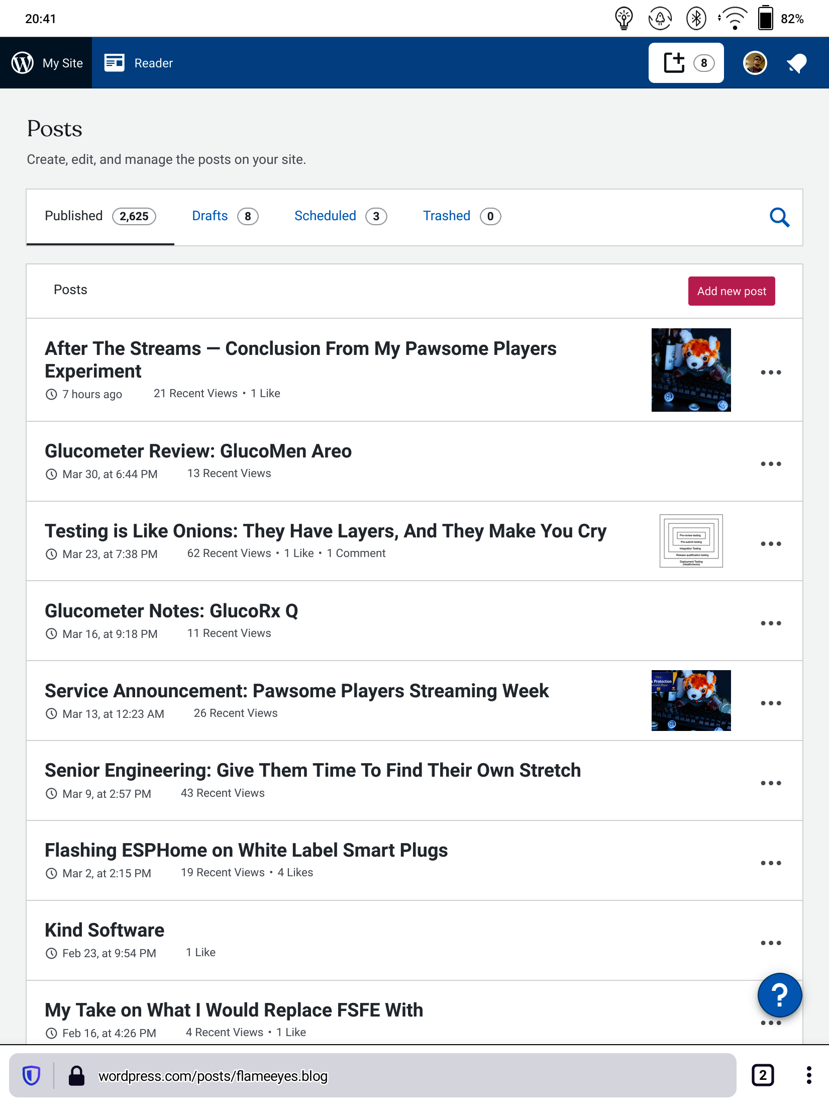
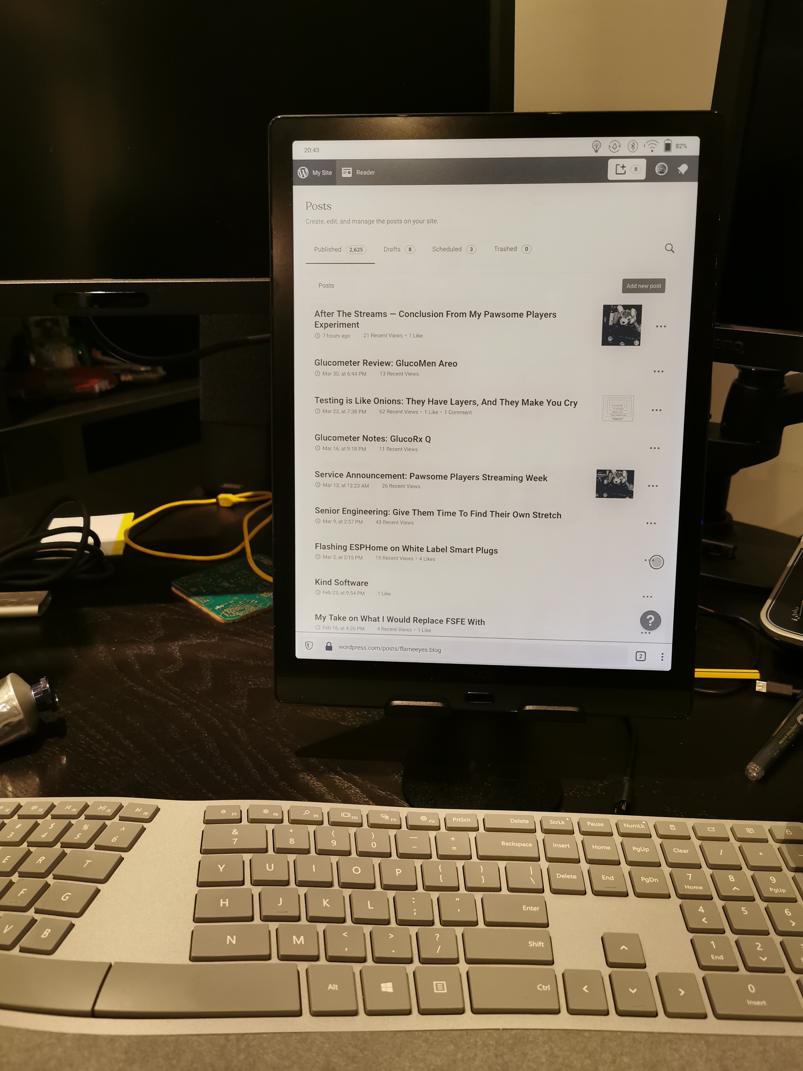
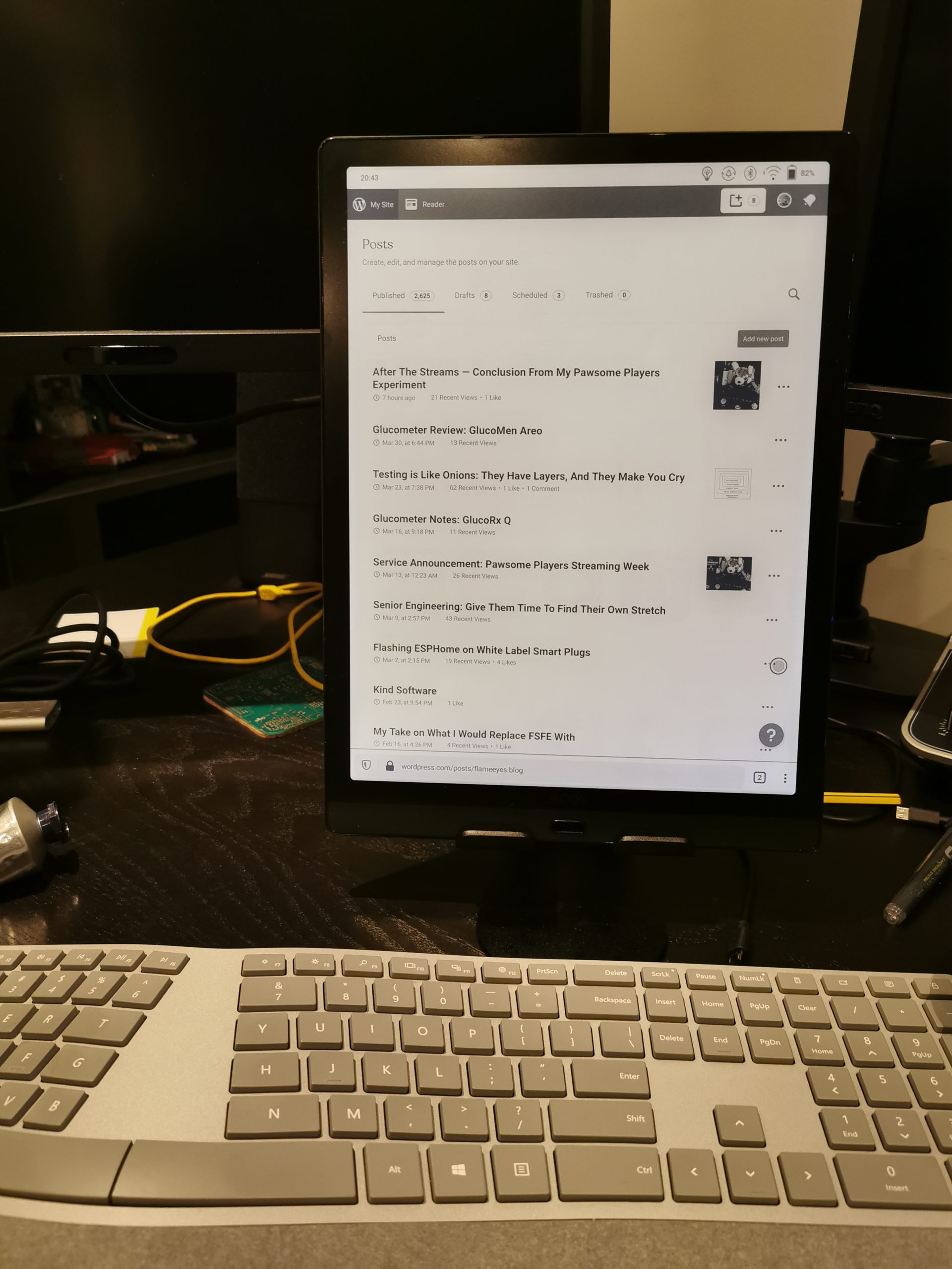
Some time ago, I found a video from Technology Connections over on YouTube about using eInk tablets for productivity. It’s part one of a number of other videos exploring the usage of electronic ink (or electronic paper) displays in Android tablet, that allow an experience that is a compromise between a fully featured Android tablet, and a Kindle-like device.
This piqued my interest, which is not surprising given that, like Alec, I have been an early adopter of ebooks, suffering through the pain of my Sony PRS-505 before landing on Amazon’s love-hated Kindle. But in addition to the ideas that he showed in the videos, I was also already considering whether to get myself an ePaper drawing tablet to use to take notes and doodle diagrams to share on the blog, although I was considering the reMarkable rather than the Onyx at that point.
The main reason why I was mostly considering rather than going for it, was that it’s not a small investment. As I pointed out in a previous post, despite now having a significant easier access to funds, I’m trying to balance the investment on my personal visibility with having time (and resources) for my wife. Buying a device that is mostly to draw diagrams on is very much overkill, if what you do for a living is not drawing diagrams left and right. And while the idea of being able to doodle on eBooks was singing to my inner geek, I knew that it wouldn’t have been nearly as useful as the Kindle is to me.
Things changed when I got to the point of Alec’s videos in which he points out how he used the device with a bluetooth keyboard to work on his (video) scripts, to avoid tiring his eyes as much with a monitor. That spoke to me, and to my wife, who fell just short of ordering it for me, and instead insisted I get one. Which I did, together with a stand (which I will admit I don’t like). I already had a keyboard (a Microsoft Surface Ergonomic Keyboard that I bought a few years ago in the Microsoft Store in Seattle, and that I think could have been much better, but is still better than your average bluetooth keyboards).

In terms of which device to get I went for the highest end that was available, the Onyx Boox Max Lumi. The reason for that is once again to do with our old friend the compromise: a bigger device is harder to bring around, but I don’t think I’d be blogging on the go that much with this device. If I am going to be doing that, for instance at my mother’s house, if we ever get to see her this year, I would be using my laptop, most likely. As such, getting a bigger screen means having more space to draw diagrams. But in particular the 13″ suggested it would be possible to use it horizontally to write a blog while reading off a different source, although that one doesn’t look like it’s going to be feasible any time soon (give me a moment to get to that).
My original intention was to use this primarily through the WordPress application, because I thought it would be easier to use the block editor in that. Unfortunately, it looks like the WordPress app is not only not suitable for the Onyx Boox but it’s not suitable for many tablets either. The problems with the interface itself can be ignored, for the most part, if you just want to use it to type in blog posts. But because of the background color effect on the block editor, the text in the block editor appears hard to read with the “halo effect” to indicate the contrast.
Thankfully, similarly to what is reported in Technology Connections video, both Firefox (to a point) and the website (to a point) are usable enough to not make this a waste of time and money. Unfortunately, I think there is a long way to go to make this a much better platform for blogging.
The first question to ask, is whether the display is even fast enough for using with a browser, and the answer is a resounding yes. Since the videos, it looks like Onyx has improved significantly the handling of refresh modes, introducing two “faster” refresh rates that come with more ghosting, but allowing a much smoother operation of scrolling. They automatically enable these modes when scrolling, and they even introduced a one-tap “refresh the screen now” mode, that is one of the requests Alec makes in the videos. So either Onyx is taking that feedback directly, or they have otherwise reached the same conclusions.

Despite the screen allowing extremely fast “drawing” (minus ghosting), it looks like applications needed to be designed somewhat explicitly for them to make use of those capabilities. The included note app is a pleasure to draw on. The Italian crosswords magazine La Settimana Enigmistica, on the other hand, is disappointingly slow, not showing the traced writing in real time at all (I’m still not sure why they don’t optimize more for tablets of this kind — I would argue that they could easily sell a branded tablet with EMR pens, and it would maybe not fly off the shelf but definitely sell to a number of hardcore fans; I’d get one for my mother for sure).
As I said, I’m using this with a keyboard, and this is where the next problem is: Android is kind of terrible when it comes to physical keyboards. They work, mostly, but everything is a bit odd around them. So for instance, the default AOSP-based keyboard supports dead keys for grave (`) but not for single and double quotes (‘ and “), and it turns out I rely on those being dead keys a lot — all of my typing would look off without it.
I found a way around this, with a £2 application that allowed me to configure individual dead keys behaviour, but it doesn’t quite solve it for me. The next thing I would be needing is a way to have a compose-like behaviour that would allow me to access em- and en-dashes. I am actually considering two options for that: the first is to create a custom layout, the way the tool I bought allows me to (very complicated and annoying, and reminds me of having to reinvent US International on Mac OS X with Ukelele), the second would be to figure out how hard it is to take the AOSP keyboard and make an US International keyboard with compose behaviour. Of course if anyone is aware of that already existing, I’m happy to take it. Open source would be an advantage (to fix if something doesn’t quite work the way I want it to), but I’m happy to take something closed and paid to avoid having to deal with side-loading if it exists.
But the most annoying problem with the keyboard might not even be a problem of Android itself. It might be a problem of Firefox, or WordPress, or something in the whole unlikely setup: sometimes when I navigate to a different point in the post, and try to edit it, characters are inserted in different places. Often at the end of the post, sometimes the location I had just moved a few seconds before. This is not constant, and it happens no matter whether I use the keyboard to navigate, or I tap on the page. Given I’m using the web version of WordPress, it might be a browser-JavaScript-Uncommon setup problem, but it is aggravating. I have tried Edge, to see if it would make things better, but despite being actually able to give a much better experience, closer to a normal desktop (including the presence of as-you-type spellchecker), its insistence in zooming on the WordPress interface as I want to type on it makes it impossible to use.
As you probably noticed by now, I have not really used this to make diagrams yet. I’m not sure I have anything this very moment that would benefit from me drawing a diagram of things, although I do have a couple of ideas for later. For now I’ve only used it to scribble and try out the Staedler Noris Digital (which I got for crosswords on the Samsung tablet instead). Again, this needs specific support for this type of devices, and so most of the tools around this do not work. Microsoft OneNote is unusable due to latency; Jamboard is a bit better but nowhere close to the original Notes app; and Squid is nearly usable, but again, the internal Notes and Books apps are so much faster.
One thing that is definitely clear from using this device for a week or so, is that for this device class to be a killer, we need applications to optimize for it. It might sound like an empty phrase, given that I do not work on any application that might be involved, but I also think that a number of these different device classes have come up over the years, and sometimes they managed to establish themselves. When I first got an Archos Android TV device, it was nearly one of a kind. It wasn’t easy to use, and it wasn’t particularly powerful. And because it was pretty much based on the Samsung Galaxy design, it ended up going stale pretty quickly after. On the other hand, there are now a number of Android-based TV devices, not last Amazon’s own FireStick. So the class itself didn’t disappear despite the one device being, frankly, a failure.
Similarly, while Samsung was first to market (or at least the loudest to market) with high-precision, pressure sensitive pens with their Galaxy Note series, the same technology is now in use by a number of other manufacturers, including this very device, and supported by a number of different applications. So I do not see why, in 2021, we shouldn’t be expecting more applications to make use of the tools that are available, even if it’s for a small percentage of users for now. So if anyone is aware of any Android application that makes use of the capabilities for fast drawing on this and other devices, even if it’s a paid app, please let me know.
I have just used this device now for about a week as I finish drafting this post. My impression is that it was a good investment for my eyes, particularly as working from home during a pandemic does mean not resting my eyes as much as I used to (no more stepping from the desk to grab a coffee with Luke when something irks me, no more hour-and-change break after going through the Californian email, while commuting to the office). It does mean I’m not actually resting my eyes as much, but it does mean I don’t tire them as hard as I used to.
There is also one more interesting thing here, which is the fact that, for the blog, a vertical monitor makes a lot more sense than a horizontal one! Unfortunately, it looks like it’s still hard to get keyboard covers that allow you to use the monitor vertically, and let’s not even talk about vertical laptops. But the truth is that for a long, rambly document, the vertical space is more important than the horizontal. WordPress’s own editor does not really scale to fill the whole horizontal space when you use it on a normal monitor, but it works like a charm on the “mobile” editor as loaded by Firefox.
There are a few more things that would make the overall experience more “professional”. As I said, if the WordPress app was usable, it would be much easier to type, rather than having to deal with the silly “cursor is in one place, characters appear somewhere else” situation. And if Edge didn’t randomly zoom in the wrong place, it would probably be the best browser to use on this particular devices, including the ability to switch tabs on Ctrl-Tab (with the external keyboard of course).
The other thing this just may be usable for is coding. Not the “full software engineering” type of coding, but if you are working on, say, adding documentation to an extensive codebase, it might be a good thing to have at hand, if nothing else because it’s vastly distraction free, and makes for an easy to read screen. You could say that this is the modern equivalent of using monochrome displays with a Commodore 64 to get the sharper fonts.
At any rate, you can probably expect more blog posts and possibly Twitter questions and rants, over the next few months, as I try my best to keep up with the blogging as the lockdown finally eases, and I can finally go out and enjoy my cameras, too.

“sometimes when I navigate to a different point in the post, and try to edit it, characters are inserted in different places.”
I have noticed this behavior when I try editing YAML from the Home Assistant interface on a mobile device. It is very confusing and infuriating. It might be related to the editor being a contentEditable HTML element with fonts and colors and lots of JavaScript, while the keyboard tries to use the “word input” method; but that’s just a guess.
Regarding a vertical monitor, I’ve been using vertical monitors (on PC) for years, and it’s really good for coding (long text files) and browsing (long pages with limited width). And it’s convenient to do split-screen with the top half and bottom half. And title bars, menu bars, location bars, tool bars, task bars… They don’t take up as much area in a vertical display.
The only disadvantages of using a vertical display is for watching videos (not a big deal), and for gaming (many games don’t work properly in full screen mode, and some games don’t even allow resizing the window in windowed mode).